A mass driver is a speculative technology for launching satellites into orbit. The principle is that, rather than using a rocket, a ground-based linear track magnetically accelerates a payload to orbital velocity — catapulting it into space without the need for chemical fuels. The decision to name my studio after this concept perhaps helps to illustrate the love I have for science fiction.
My appreciation for the work itself is difficult to uncouple from my love of the visual language of the genre. The imagery of science fiction is iconic, otherworldly both in literal content and in execution. Aided by a perception of sci-fi as markedly pulp, cover artwork for magazines (and, later, paperbacks) had not only the inspiration but also the freedom to be stranger and more experimental than other genres.
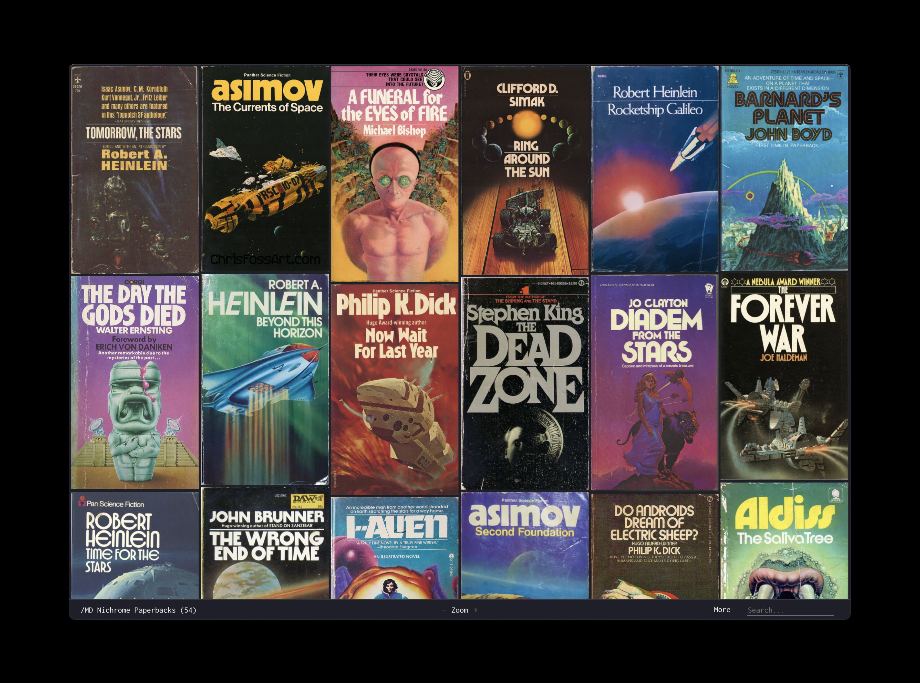
The maturity of science fiction developed profoundly in the late 1960s and ’70s. The ‘New Wave’, a more experimental and political movement within the genre, drew from both the scientific revolution of the Space Race and the political landscape of the time: the rise of environmentalism; Vietnam; the Cold War. This coincided with a change in the medium through which science fiction was typically consumed, too, as it moved away from pulp magazines toward paperback books.
At the same time, new developments in design and type technology contributed to these books’ unique visual language. By the start of the ’70s, science fiction paperbacks were a rich, vibrant gallery of psychedelic illustrations and expressive type — designs from the earlier part of the twentieth century, as well as brand new typefaces, created contemporaneously.
The wealth of imagination present in paperbacks (and especially their cover designs) from the late ’60s through to the early ’80s, has been an obsession of mine for a long time. My first (unsuccessful) effort to capture it in a typeface was back in 2016, when I was still a student of graphic design — my latest attempt, started in early 2020 and decidedly more successful, is MD Nichrome.
I’ve touched on this regarding the process behind MD Primer, but something I think about a lot in my work is the idea of the technology gap. When a creative work moves from one medium to another, not every part of it survives the transition: the digital version of a typeface originally cut in metal is an imperfect replica, just as a film is never the same as the book it was based on — and for much the same reason: the work must be re-made to fit a fundamentally different medium.
In the design of MD Primer, I was interested in the divide between metal and digital type — but these are not the only two technologies to have been used. In the 1960s, two new typographic processes were gaining rapid popularity: phototypesetting, by which letters on a film negative are projected onto photo paper; and dry transfer,¹ where letters on pre-printed sheets can be rubbed off onto a design.
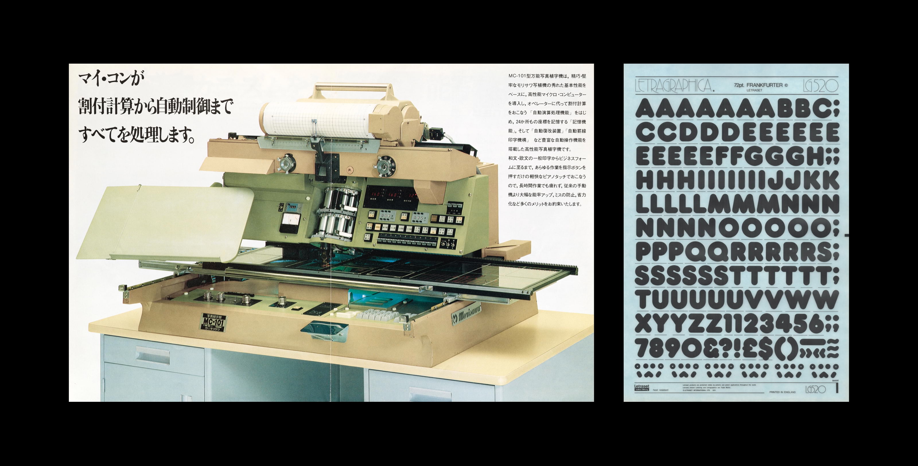
Right: Letraset dry transfer sheet (image courtesy Dan Rhatigan, letraslut.com).
As with metal type, typefaces designed for dry transfer or phototype cannot directly be converted to digital fonts: the process of digitising them is painstaking and manual. Not every design manufactured for analogue tools has undergone this digitisation process, and many are unavailable to the modern designer.
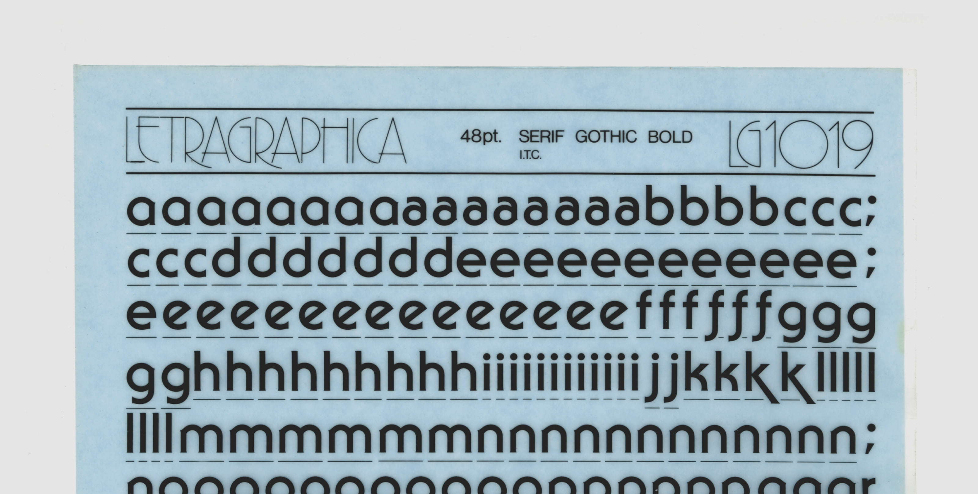
But there’s another complication in the digitisation of these designs, for dry transfer typefaces in particular: spacing. In both metal and digital fonts, the space between letters is as significant a design feature as the letters themselves. The width of a glyph in these formats intrinsically contains spaces either side of the outline, known as sidebearings. The glyphs on a dry transfer sheet do not — they’re often accompanied by a guideline of some kind,² typically dashes below each letter marking its recommended sidebearings, but the final spacing of a piece of text is ultimately left at the discretion of the typographer.
The result is that spacing in dry transfer designs often becomes dependent on the typographer. Where the sidebearings in a metal or digital font must be carefully designed so that any given combination is evenly spaced (with kerns being added for the few places where this is impossible), a typeface intended for dry transfer sheets can be much more free in its proportions. It’s not so vital that each letter combines evenly with every other, since the typographer can be relied on to assist — even to space an entire word differently, if necessary, to accommodate an awkward combination.
What this ultimately means is that even if the outlines of a classic Letraset or Mecanorma dry transfer typeface are immaculately digitised,³ the spacing cannot be — because the spacing was never truly a part of the font: it was created at the point of use. Even if the digital version of Serif Gothic was perfectly drawn,⁴ to match the style of its best analogue examples it would need to be manually kerned wherever it was used — frustrating in desktop software, nigh impossible on the web.
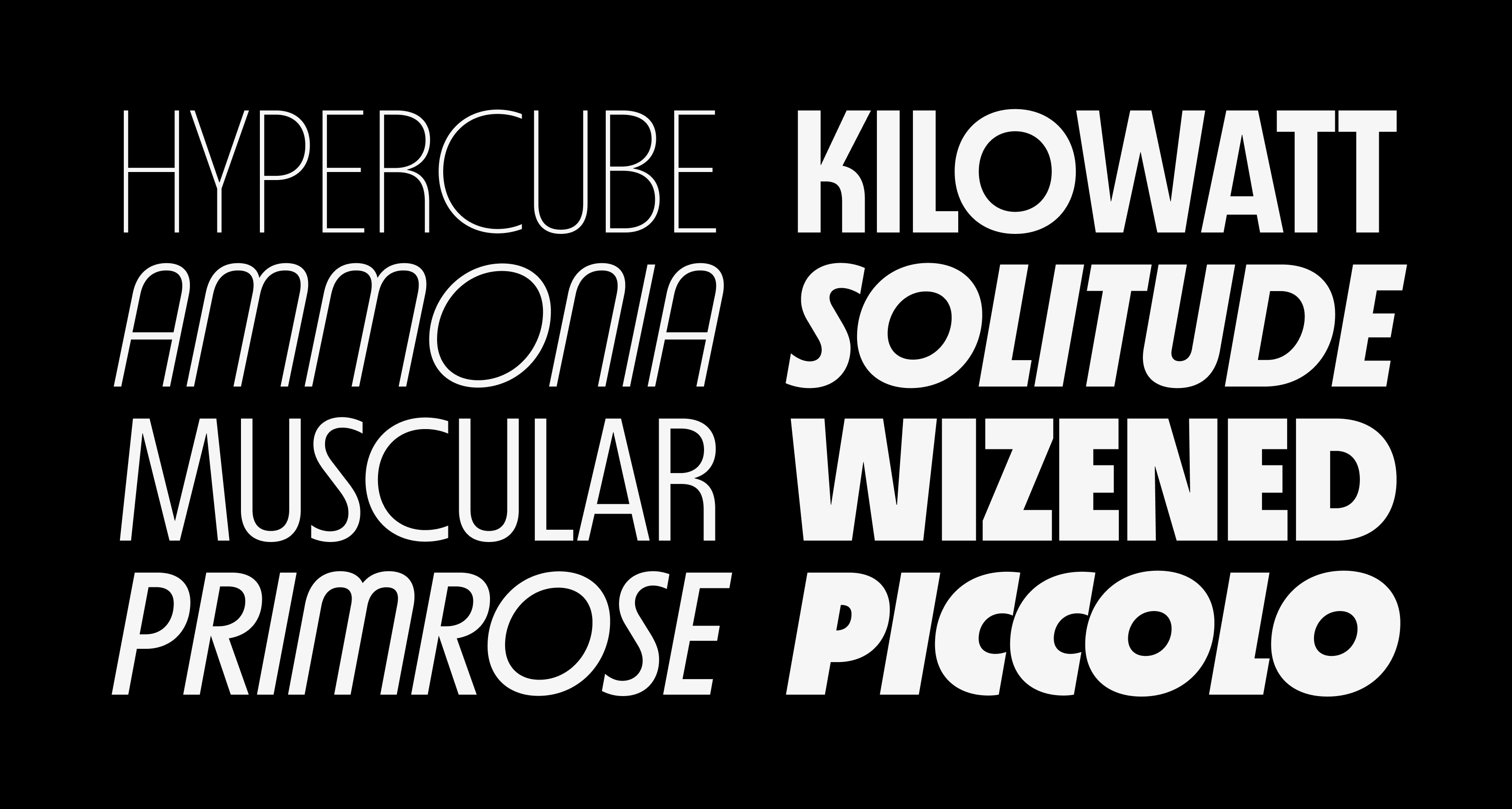
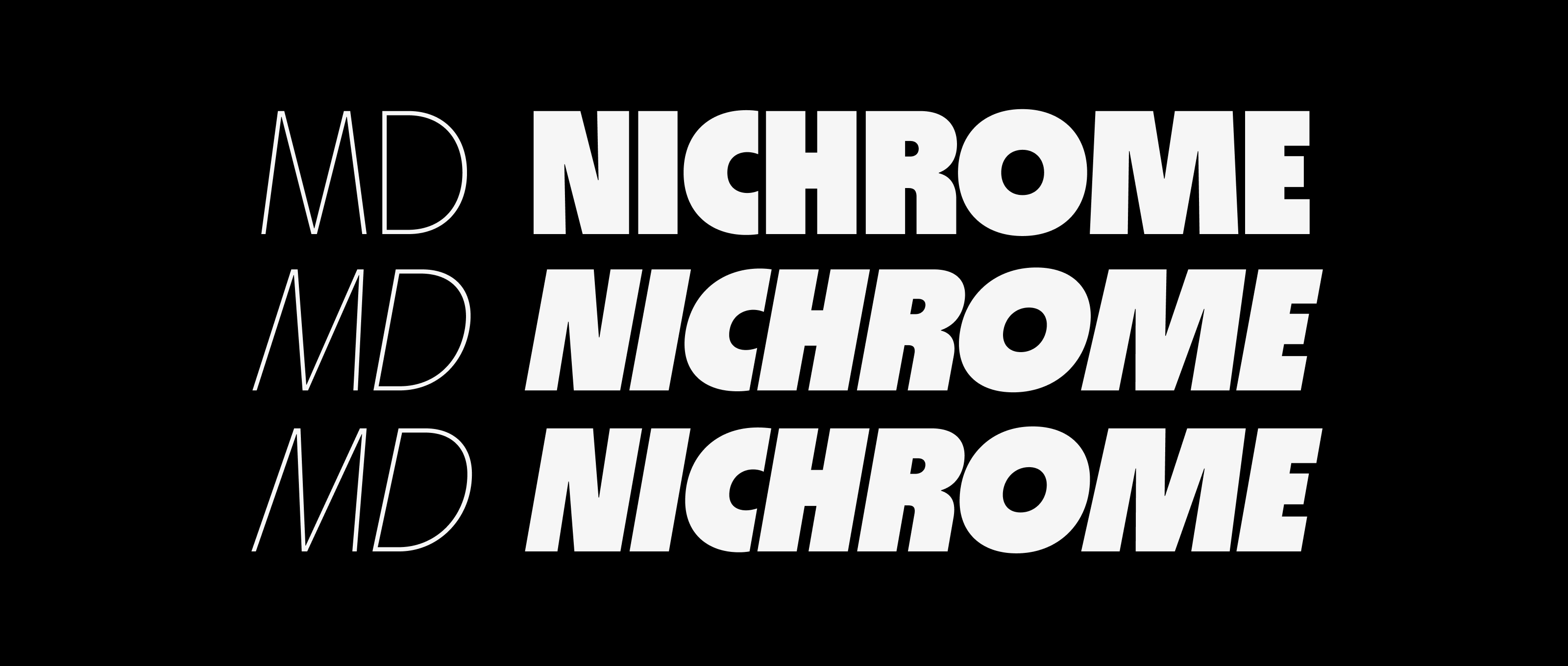
MD Nichrome’s design is rooted in this notion. It was never an attempt to revive or imitate any single typeface from the dry transfer era, but rather an effort to distill the spirit of those designs into a typeface that works, first and foremost, digitally.
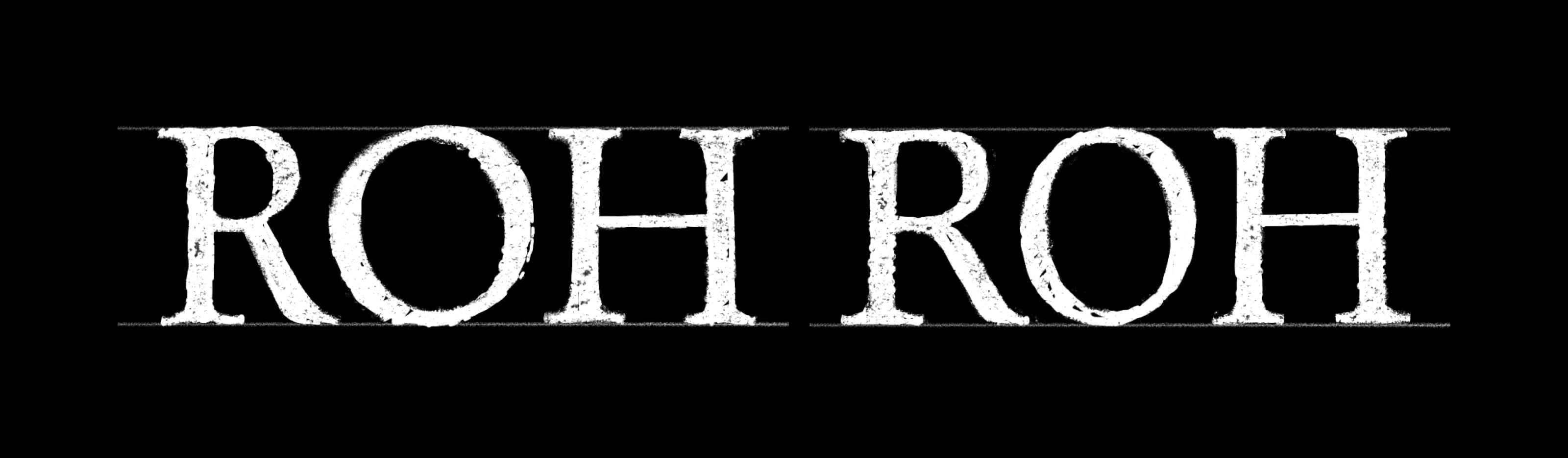
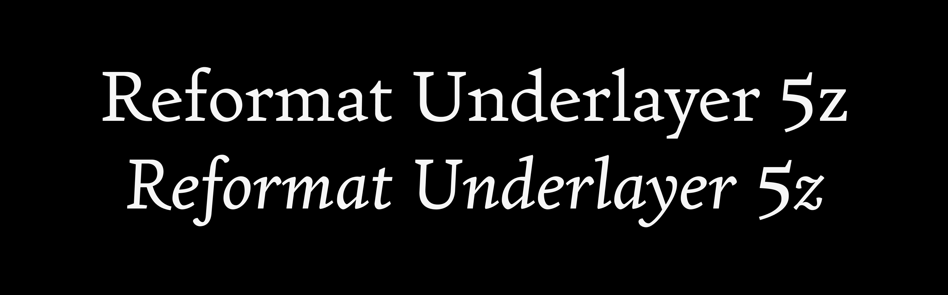
Note the digital version’s slightly stretched o, lower serif on the V, and regular-height s — the descending form used in the original design was seemingly never digitised.
Early in the design process, I was very clear on a few things: it was going to be a display typeface, tightly spaced, probably a large x-height and short extenders.⁵ I also knew that I wanted the design to feel geometric, which in digital type is its own challenge.
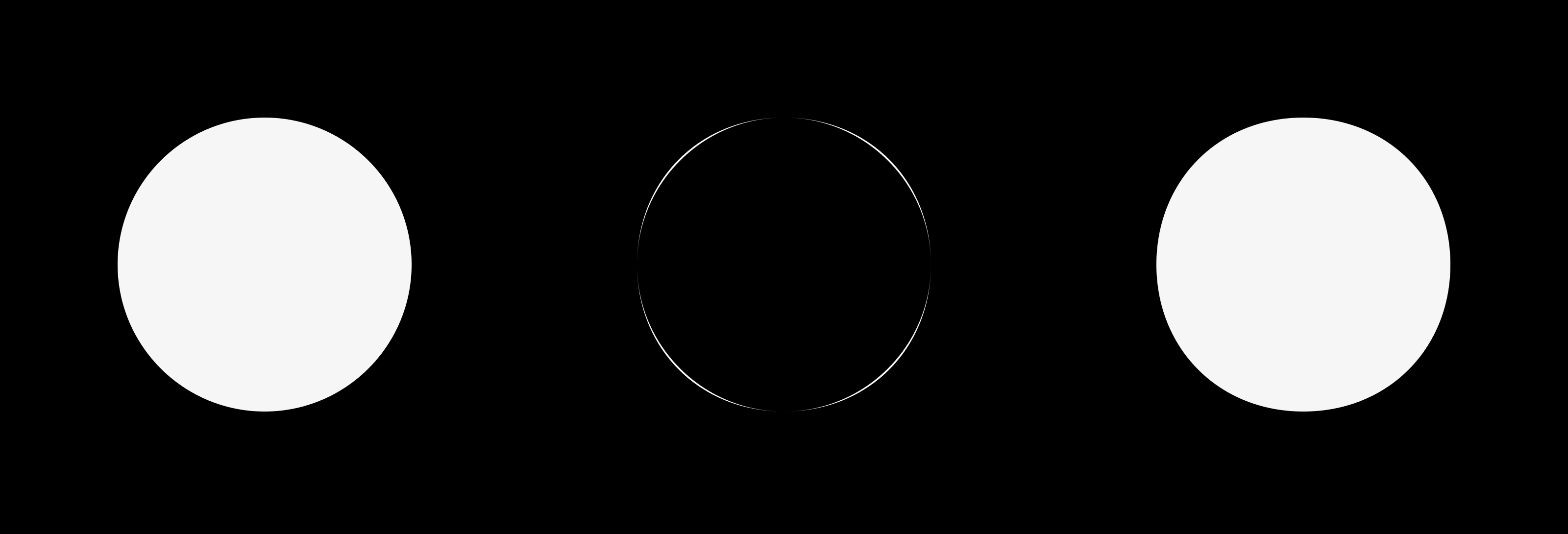
Geometric typefaces tend to fall into one of two categories: ‘truly’ geometric designs, literally constructed from primitive shapes; and ‘perceptually’ geometric ones, which have the appearance of geometry but are carefully modified to counteract the uncomfortable characteristics it produces. A mathematically perfect circle, for instance, does not actually appear perfectly circular — it seems too bold at the top and bottom, and ‘pinched’ in the corners. A perceptually geometric typeface compensates for this and dozens of similar effects, ironically diverging from pure geometry to better give the illusion of it.
The designs I wanted to reference in MD Nichrome drew from both ends of this spectrum. Typefaces produced during the 60s and 70s, particularly, seemed to be based on mostly pure geometry: Burko (1967), Yagi (1968), ITC Avant Garde (1970); whereas earlier designs, notably those from the 1920s, were more refined: Erbar-Grotesk (1926), Futura (1927), Kabel (1927).⁶
I tried to strike a balance somewhere in the middle of this spectrum. While the more rigidly geometric designs felt at home in the ’70s, softened by ultimately analogue production processes, in digital type there’s a starkness to them that feels uncomfortable. Like the tactile beauty of a Brutalist concrete building, the effect requires an imperfect construction: the same building rendered as a flawless 3D model falls short. Then again, I didn’t want to push the shapes of MD Nichrome too far the other way: the O still needed to feel like a circle.
Some of my earliest sketches for the design concentrated on proportions. Originally I had envisioned the typeface as a family of not only differing weights, but also widths. Quite soon though I realised that a variance in proportion within a single width was both more interesting, and more in line with other designs I was referencing.
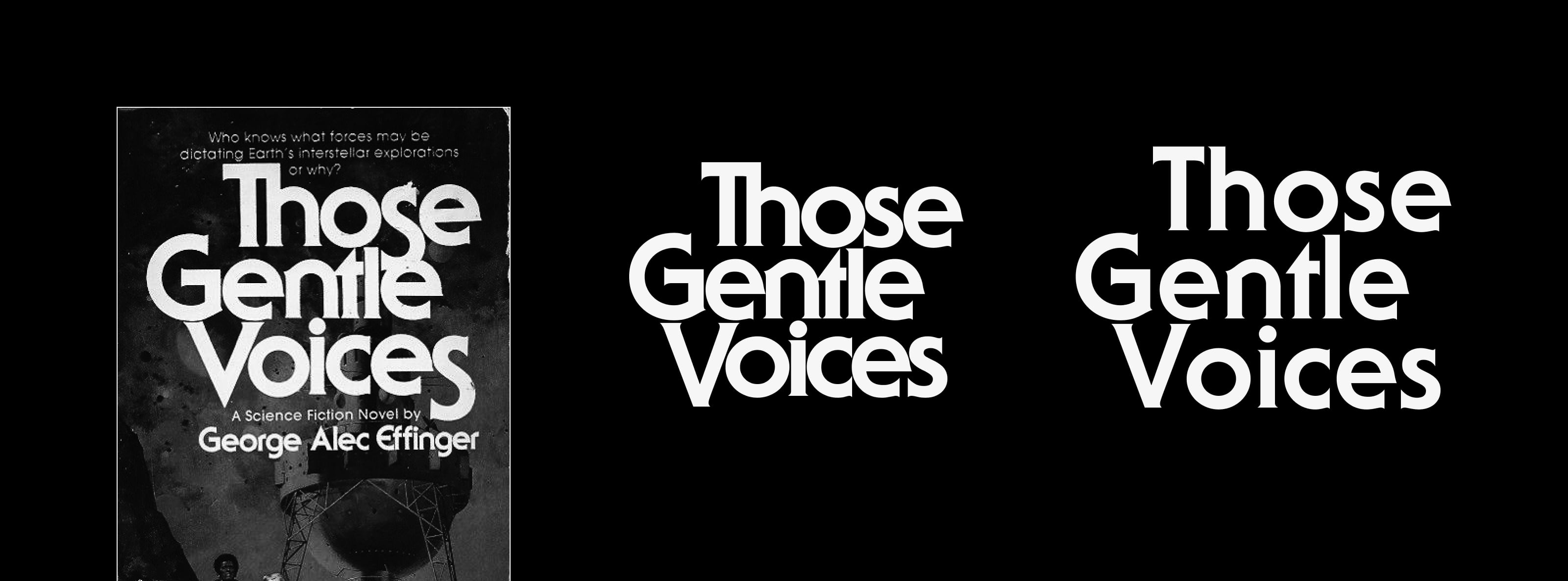
The horizontal proportions of a typeface — the relative widths of its glyphs — are one of its defining features, though they tend to be overlooked. Typically, most designs will fall somewhere on a spectrum between the traditional Roman proportions (wide O and H, narrow E and S, triangular A and V), and the more modern ideals, wherein most letters are similar in width. But a hallmark of ’70s-era designs is a more freeform horizontal proportion: designs like Syncopation (c. 1970) and Marvin (1969)⁷ diverge from conventions, typically keeping a very circular O but condensing the H, with other letters seeming sometimes arbitrarily wide or narrow.
This was a difficult effect to get right for MD Nichrome, but I think it’s ultimately what defines the design more than anything else — the constructions of most letters are otherwise fairly conventional, but the proportions place it squarely in the era I wanted to allude to. As with many of the reference designs, this effect is more pronounced in the lighter weights, and subtler in the boldest styles.
In fact, variance across the weight axis is another substantial aspect of MD Nichrome’s design. Unlike most typefaces I’ve worked on, where the intention is to keep a similar vision across every weight or style, for MD Nichrome I instead outlined a number of characteristics from the designs I was referencing, and tried to incorporate them at specific points across the weight range.
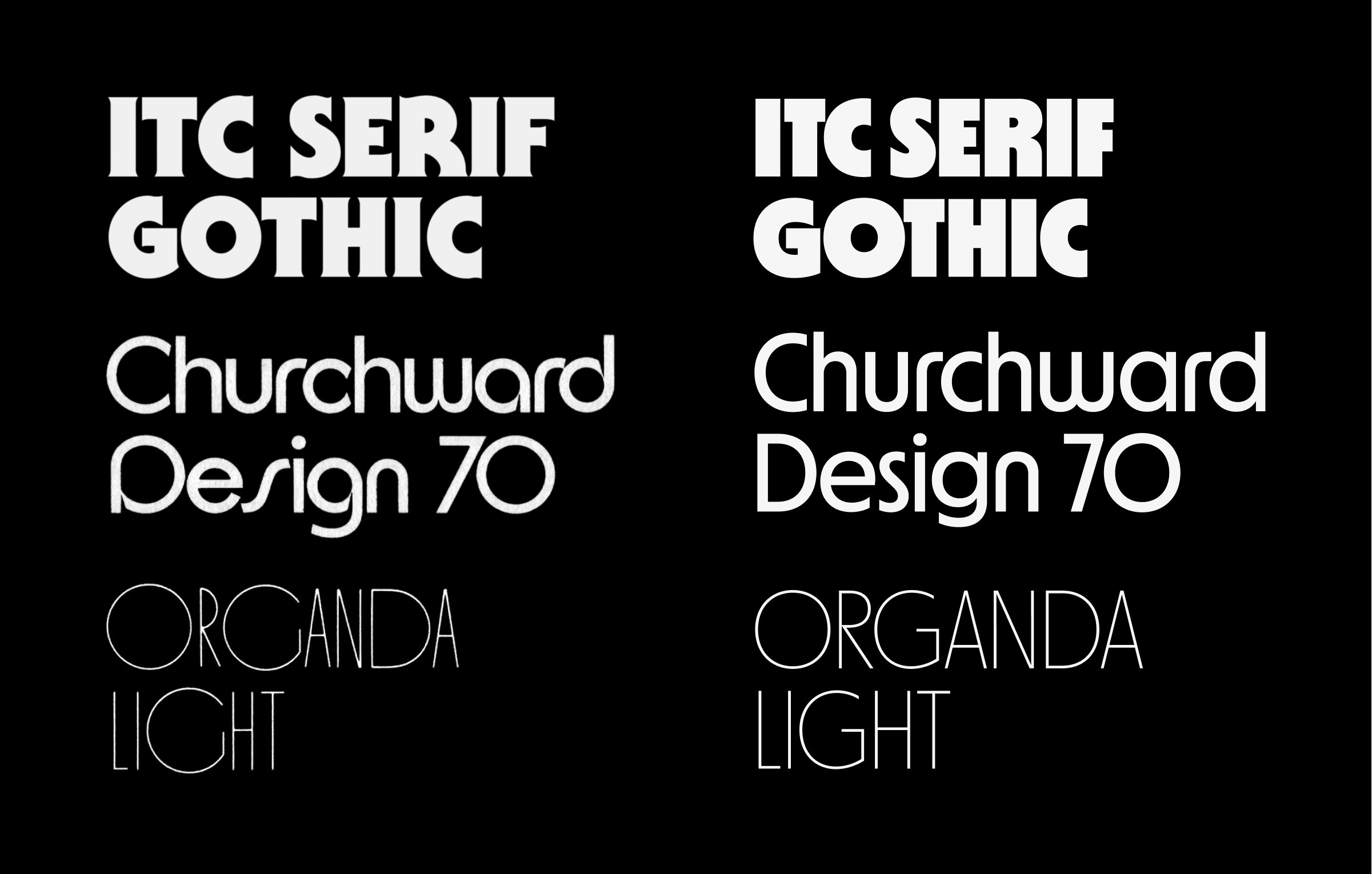
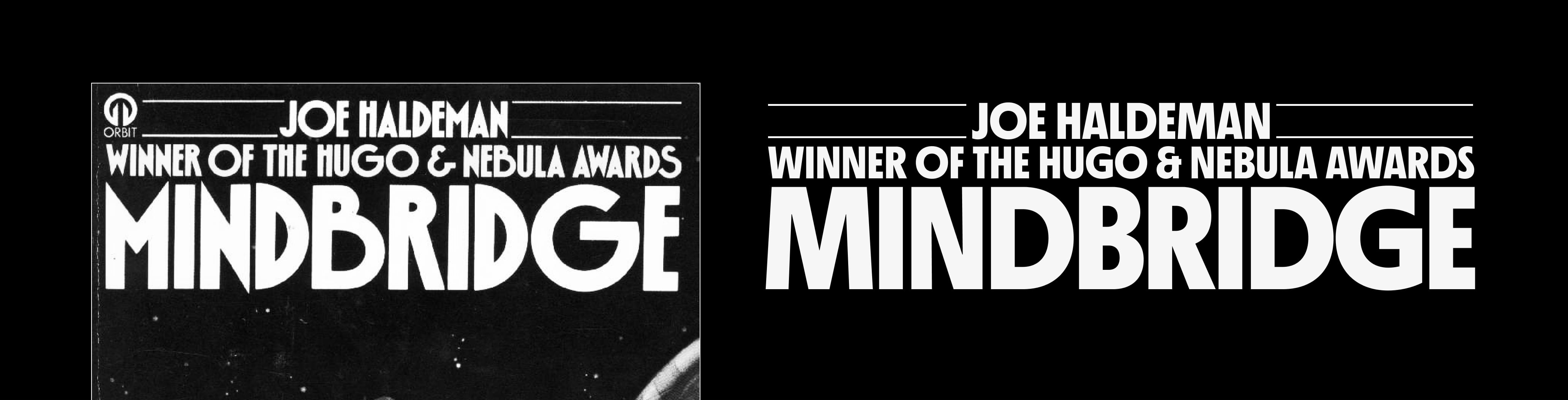
For MD Nichrome’s lightest weights, with the strongest syncopation of proportion, I looked at Organda (1972), and to a lesser extent ITC Busorama (1970).⁸ At the other end of the range, I wanted the boldest weights to be evocative of Kabel Black (1929), as well as the sci-fi classic ITC Serif Gothic (1972). These designs are both more even in proportion, and while they have the appearance of being mostly geometric, the (pre-digital) versions are optically corrected.
It’s worth noting as well that Serif Gothic is very much gothic ⁹ before it is serif: the underlying design is (mostly) a geometric sans. In the early stages of MD Nichrome, I flirted with the idea of ‘tacking on’ serifs in the same way — other designs like Cortez (1977) follow a similar idea with interesting results.
One of the larger challenges in MD Nichrome’s design was finding a balance between the two ends of this weight range. While it would have been possible to ‘swap out’ glyphs at certain breakpoints — modifying a letter’s construction between two weights — I didn’t feel like this solution would be exactly helpful to the typographer. Instead, I made a point of working on all eight weights from the very beginning, putting the challenge upfront while the entire concept was still flexible. This was also largely how I decided on the extent to which I wanted to vary letters’ proportions: the uppercase D, for instance, is significantly narrower than the O in most of the reference designs, but following that model didn’t work for the boldest styles of my design.
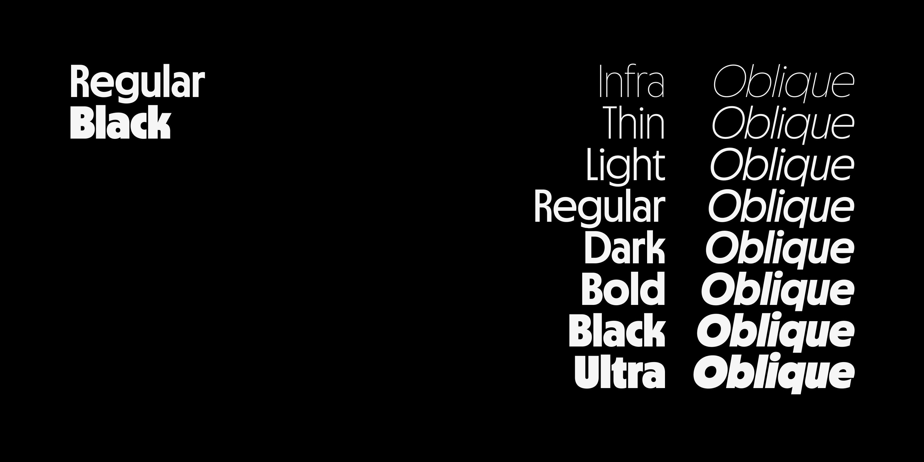
The idea that the lightest and boldest styles were designed together might be a surprise to anyone who licensed the earliest work-in-progress versions of MD Nichrome. I released the first version in late April 2020 via Future Fonts, as a very basic family of just two styles. At the time called Regular and Black, these would eventually become the Dark and Ultra weights. It wasn’t until late July that I released the lightest weight, by then known as Infra.¹⁰ The reason for this in part was simply that, while I drew it at the same time as the other styles, it took longer to get release-ready; it’s also partly because of priorities: though it had been my intention to release additional weights as soon as possible, the first feedback I had from customers was that language support and glyph set would be the best use of my time.
Releasing MD Nichrome on Future Fonts was undoubtedly one of the best decisions I made for the project. The feedback I had from actual users of the typeface, designers far more experienced than myself using my fonts in the real world, was invaluable — and a huge force in shaping the design. And to be frank, being able to earn money from licensing the in-progress design was a huge deal: early 2020 was not an easy time to start a type foundry (Mass-Driver went live in late February that year), and while I was fortunate to be mostly unscathed by Covid-19 and its aftershocks, without the early sales of MD Nichrome I would have found it impossible to keep making type full-time.
As the project progressed (again thanks to Future Fonts allowing me to gauge its popularity and cover its development cost) I was able to expand on the design I had originally conceived. Designs like Blippo (1969), Churchward Design 70 (1970), and ITC’s Ronda (1970) and Bauhaus (1975), which I loved but hadn’t been able to reference too strongly in MD Nichrome’s original design, led to the typeface’s Rounded stylistic set: alternate forms of A, M, r, n, and similar/derived glyphs. Alongside this, I added a Geometric set, with more conventionally geometric forms of the R, K, k, t and ampersand.
These stylistic sets are designed to be used in any combination: you can enable either or both at once, and the design still works. This was annoying to kern, but I think the result is absolutely worth it — not only does it make MD Nichrome more stylistically versatile, it also allowed me to spend even more time researching the various phototype and dry transfer typefaces I originally fell in love with.
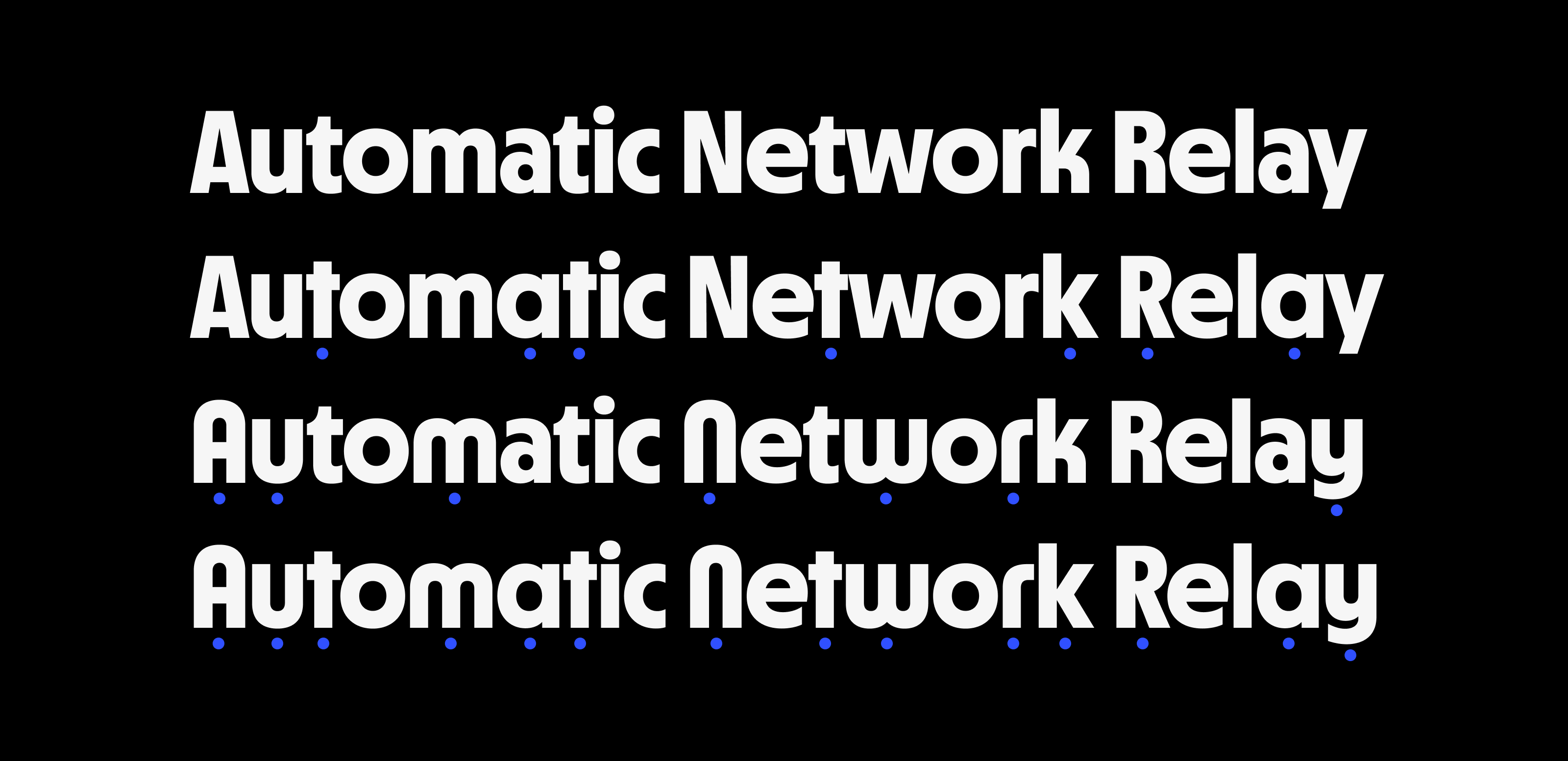
A final addition, again one I hadn’t originally planned (but which the Future Fonts release model facilitated), was MD Nichrome’s set of accompanying oblique styles. A number of people had requested italics, and I largely agreed that they would be a useful addition. But rather than a conventional italic, I wanted to pay tribute to a rarely celebrated (in fact generally scorned) typographic motif of the phototype era: the automated oblique.
To be considered a true italic, letters should not only be slanted, but also follow a more cursive construction: the a and g are single-story, ‘simplified’ forms; often the f descends. A slanted style without any of these adjustments is an oblique — though sans-serif designs in particular often refer to their oblique styles as italics.¹¹
Since both phototype and dry transfer are based on photographic techniques, it became much easier with these technologies to produce oblique styles — whether at the point of use, or during production of the type — not by redrawing the upright designs at an angle, but by mechanically slanting them. Long before Microsoft Office made these ‘faux italics’ ubiquitous, they were a hallmark of (particularly lower-quality) ’60s and ’70s typesetting.
While the mechanical slanting process leaves unpleasant artefacts in the shapes of glyphs, notably an uneven bunching-up of weight in the top-right and bottom-left corners, I did want to allude to the popularity of the practice in MD Nichrome’s obliques. While I evened out the stroke weights compared with a mechanical slant, I skipped the other conventional steps of slightly condensing the width and lightening the overall weight by a fraction. The result is a set of oblique styles which are more cleanly drawn than a ‘faux italic’, but still have some of the quaint awkwardness visible in designs from the phototype era.
I released the final version of MD Nichrome in August 2021, eighteen months after the first release on Future Fonts and five years (give or take) since my first attempt to tackle this typographic genre. This has been one of my favourite projects to work on, in no small part thanks to the team at Future Fonts, and the support of everyone who provided feedback or licensed the typeface during its development.
I’d also like to give a particular mention to Fonts In Use. Particularly in the early design stages, their archive was indispensable — it helped me contextualise the designs I was referencing, introduced me to others I was unfamiliar with, and remains a perennial source of inspiration. I’m immensely grateful.
MD Nichrome is available now, in eight weights from infra-light to ultra-black, plus a full set of matching obliques. You can license the typeface from €50 for commercial use, and a variable font version is available on request with licenses of the complete family.
→ Buy MD Nichrome
→ Visit the Microsite
→ Download PDF Specimen
Scans of Frankfurter and Serif Gothic Letraset sheets courtesy of Dan Rhatigan (letraslut.com) (last accessed 18 October 2021).
Morisawa phototype brochure reproduced with kind permission of Letterform Archive (letterformarchive.org) and courtesy Morisawa Inc. (morisawa.co.jp) (last accessed 18 October 2021).